CARTEL ROASTERS
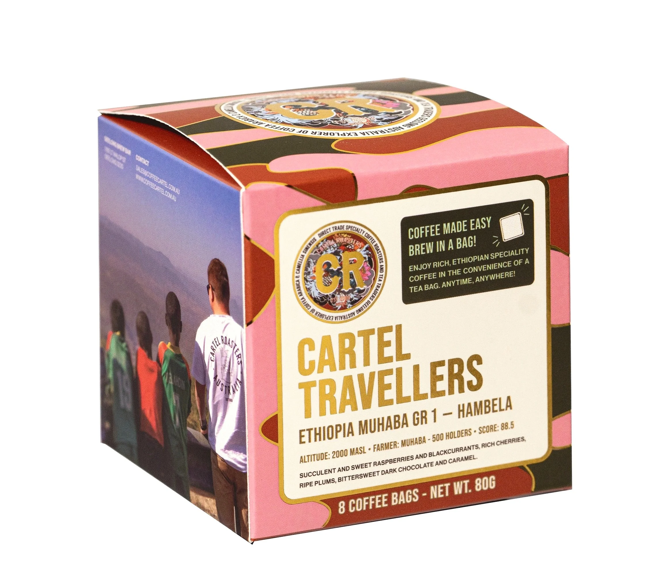
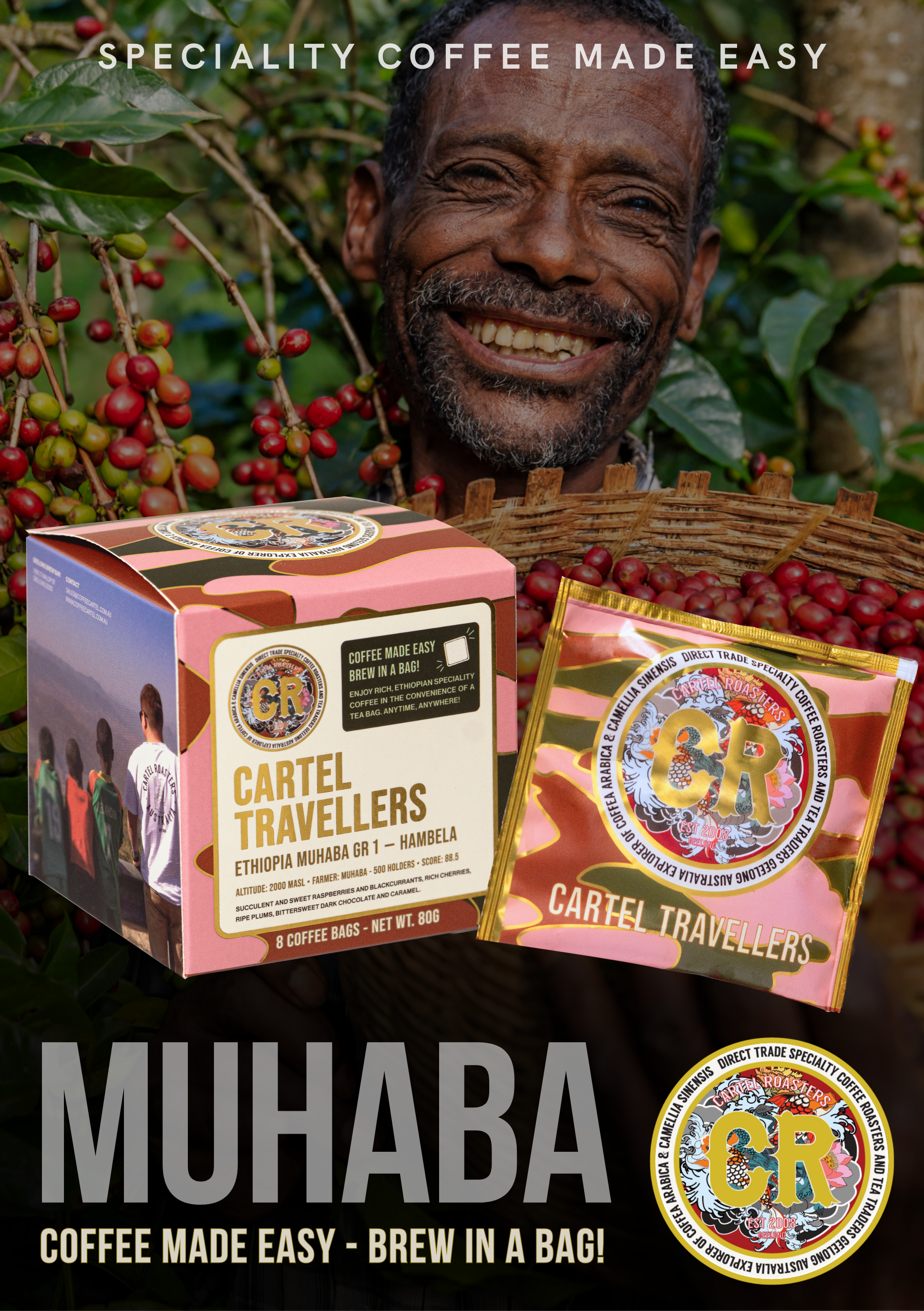
The packaging for Muhaba, a premium Ethiopian coffee from Cartel Roasters, was inspired by an army-style pattern in pink, brown, and green.
Building on this concept, I integrated custom ornamental details that reflected the brand’s artisanal and crafted identity. These elements added depth and sophistication, creating a balanced design that feels bold yet refined.
PACKAGING — mUHABA COFFEE MADE EASY IN A BAG!
-
Elevating with Gold Accents
To match the exceptional quality of the coffee, I introduced gold accents to the ornamental details. This subtle touch elevated the overall design, giving it a premium edge that mirrors Muhaba’s story. Scoring an impressive 88.5, the ethically sourced Ethiopian beans deserved packaging that highlights their farmers and value.
A Story Worth Selling
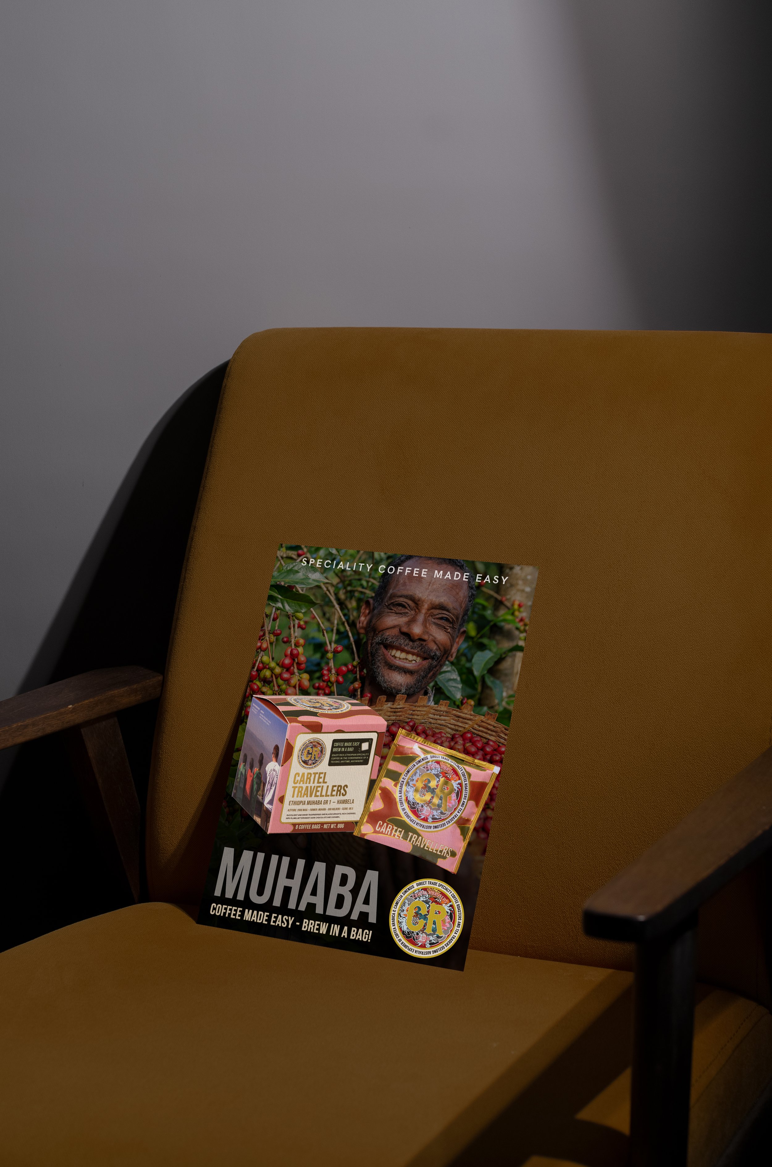
Thing packaging goes beyond aesthetics — it tells the story of Muhaba. By celebrating its origins and the farmer behind it, the design positions Muhaba as an artisanal, premium coffee that stands out. The final result combines bold visuals with refined storytelling, making it a mush-have for discerning coffee lovers.
Building the Foundation
From design to product
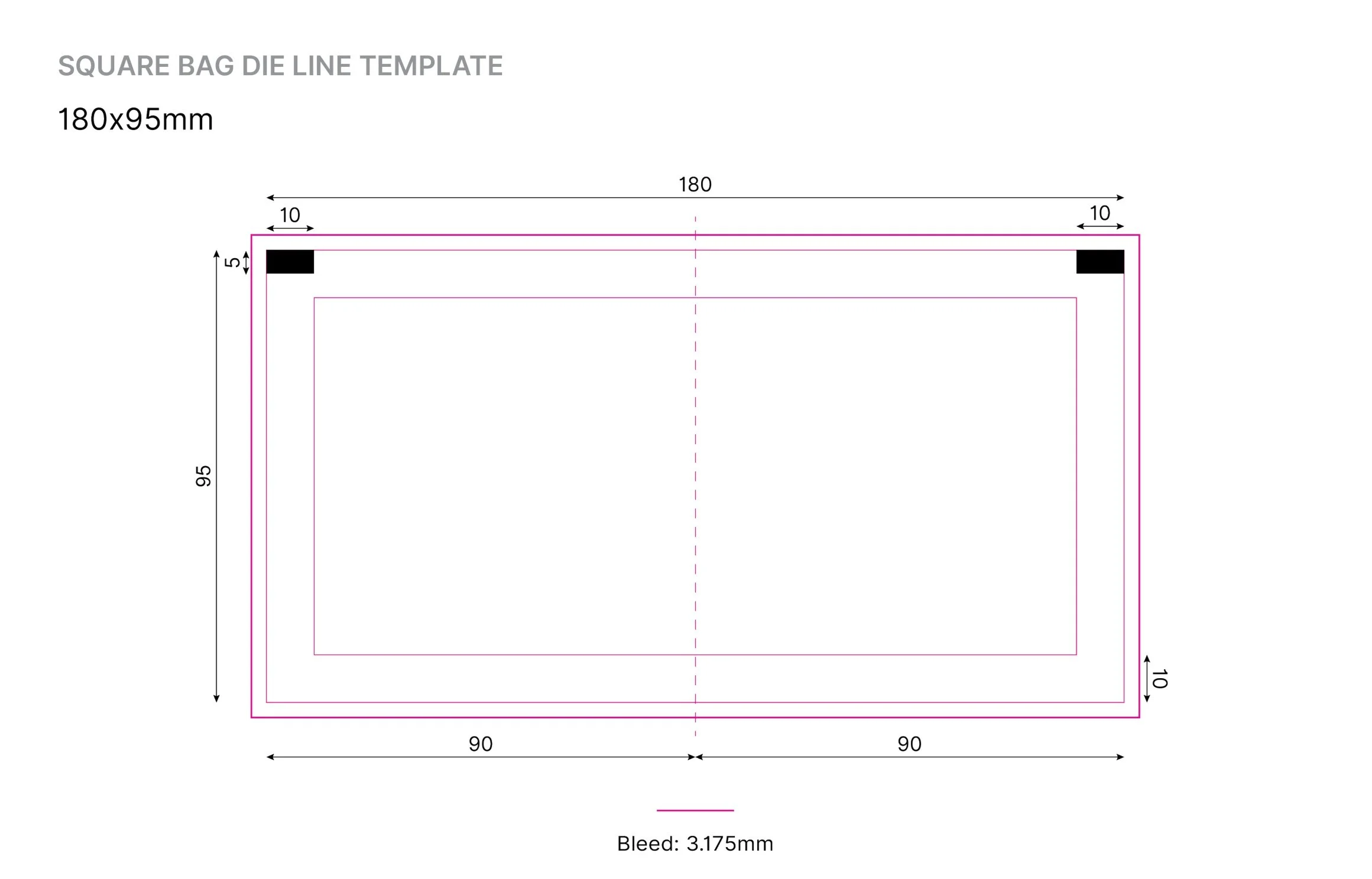
The design process kicked off with the essentials: the dieline for the sachet and box. With the groundwork in place, the army-inspired pattern — featuring pink, brown, and green — was applied, just as envisioned by the owner of Coffee Cartel. But it didn’t stop there. To elevate the design, I introduced intricate gold ornaments that matched the complexity of the brand’s logo, creating a cohesive and premium aesthetic.

Designing with Purpose
Between packaging to customer

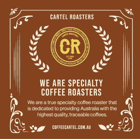
Coffee packaging isn’t just about looking good — it’s about delivering the right information. The packaging dives deep into the essential aspects of the coffee, including the bean’s region, altitude, soil type, microclimate, and its washed process. It highlights the Muhaba farmers as the origin of this premium product, focusing on the meticulous care that results in its exceptional grade of 88.5.




Positioning the Brand
First Speciality Coffee Roaster in geelong and Melbourne
This design doesn’t just package coffee — it cements Coffee Cartel as a leader. As the first specialty coffee roaster in Geelong and Melbourne offering such comprehensive detail, the packaging reinforces their reputation for quality and expertise. Bold, detailed, and full of precision, it’s a design that connects with customers and elevates the Muhaba coffee experience.