cRONCHÉUR
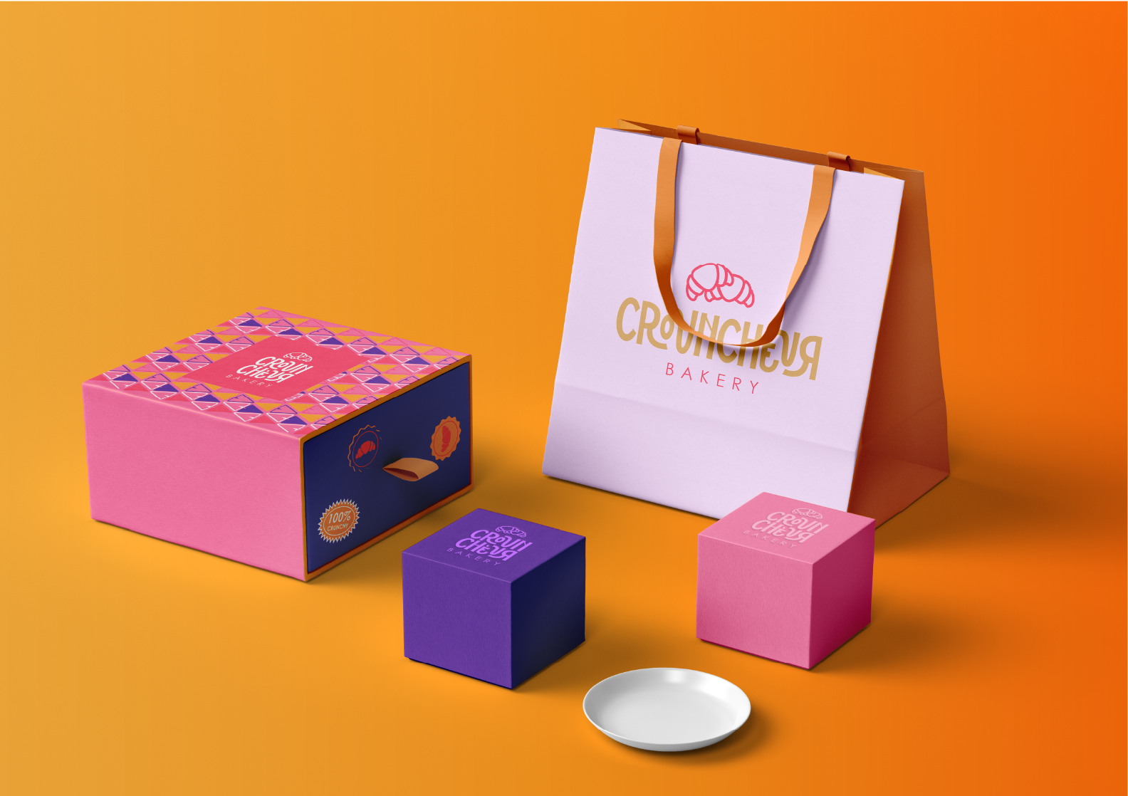
Croncheur Bakery needed to pop in Melbourne’s buzzing café scene, and “safe” wasn’t going to cut it. The mission? Blend the boldness of the 60s with the vibrancy of city life.
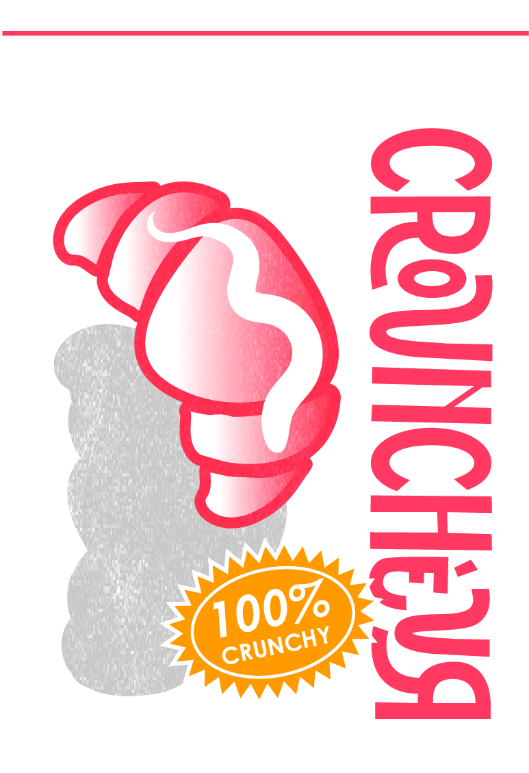
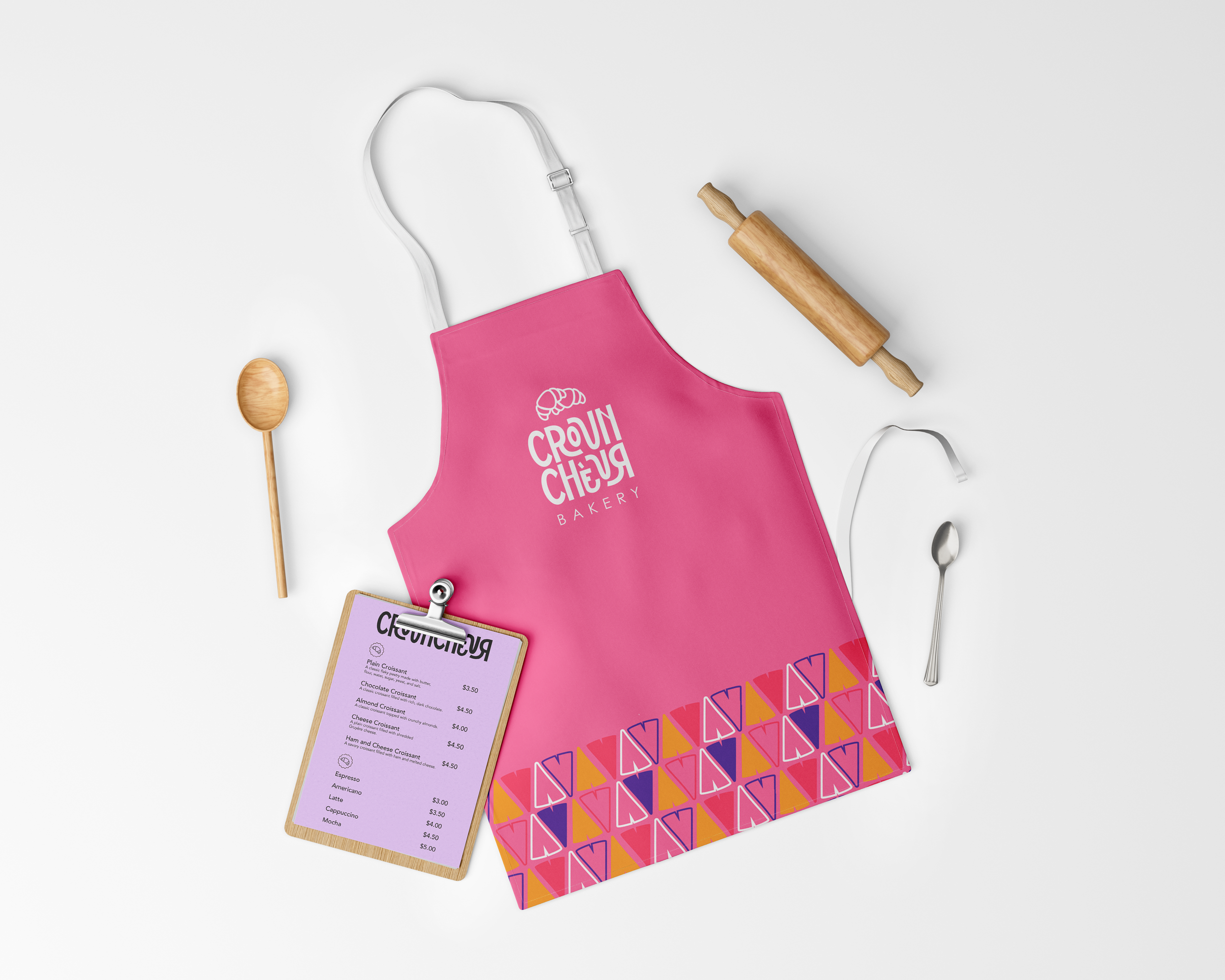
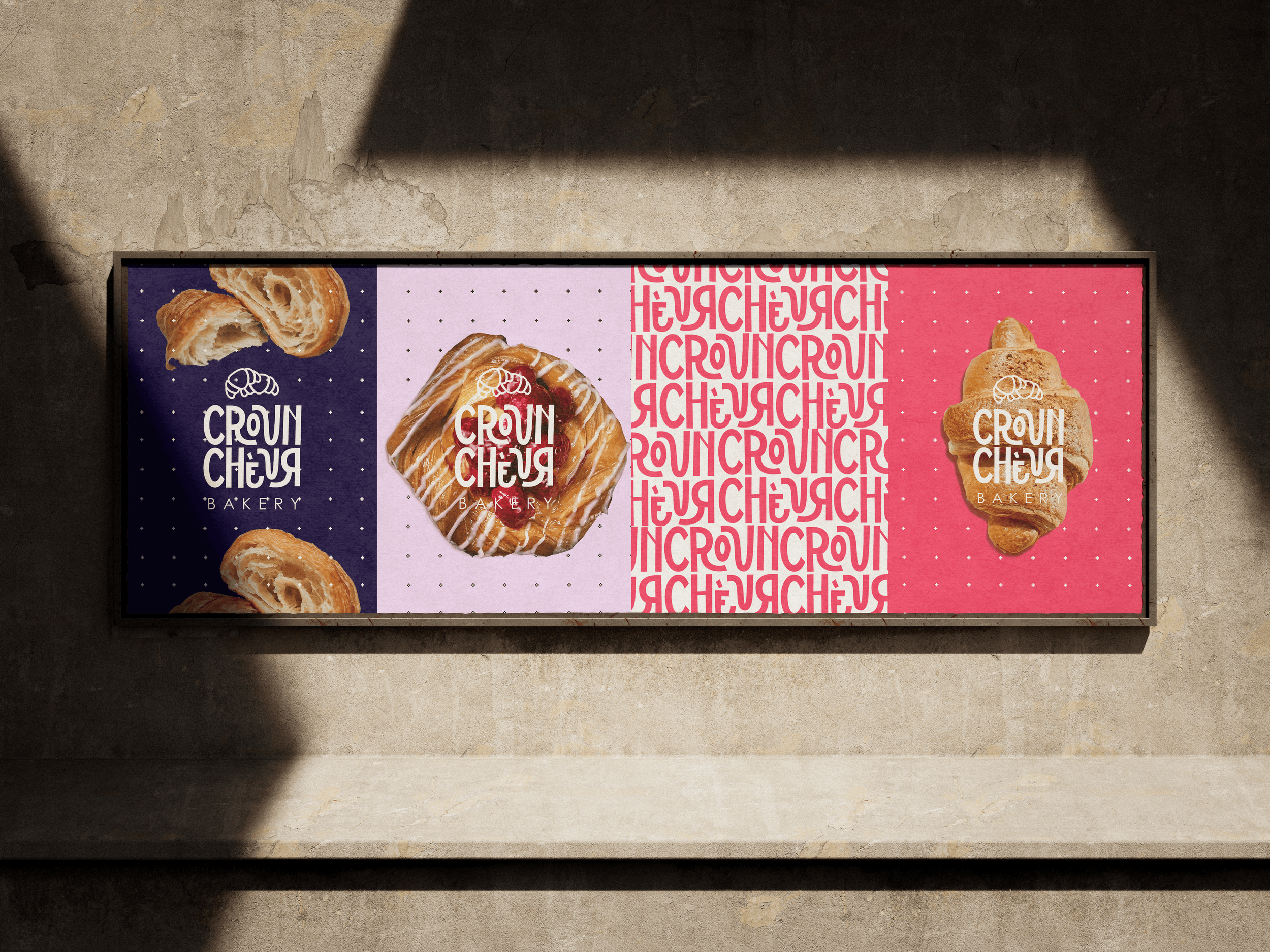
The result: A branding system packed with bright pink, yellow, and purple, retro-inspired typography, and playful illustrations. It’s fun, it’s loud, and it’s unapologetically unique — just like Melbourne itself.
BRANDING — BRING 60S TO MELBOURNE CITY