AUSTRALIAN TEA MASTERS
Australian Tea Masters had one goal: to take their Australian Native Tea Range and make it stands out as a premium product in the market. Why? Because these aren’t just any tea blends — they’re created with the most expensive native ingredients, sourced from the heart of Australia.
My mission? Create packaging that’s as special as the tea itself.
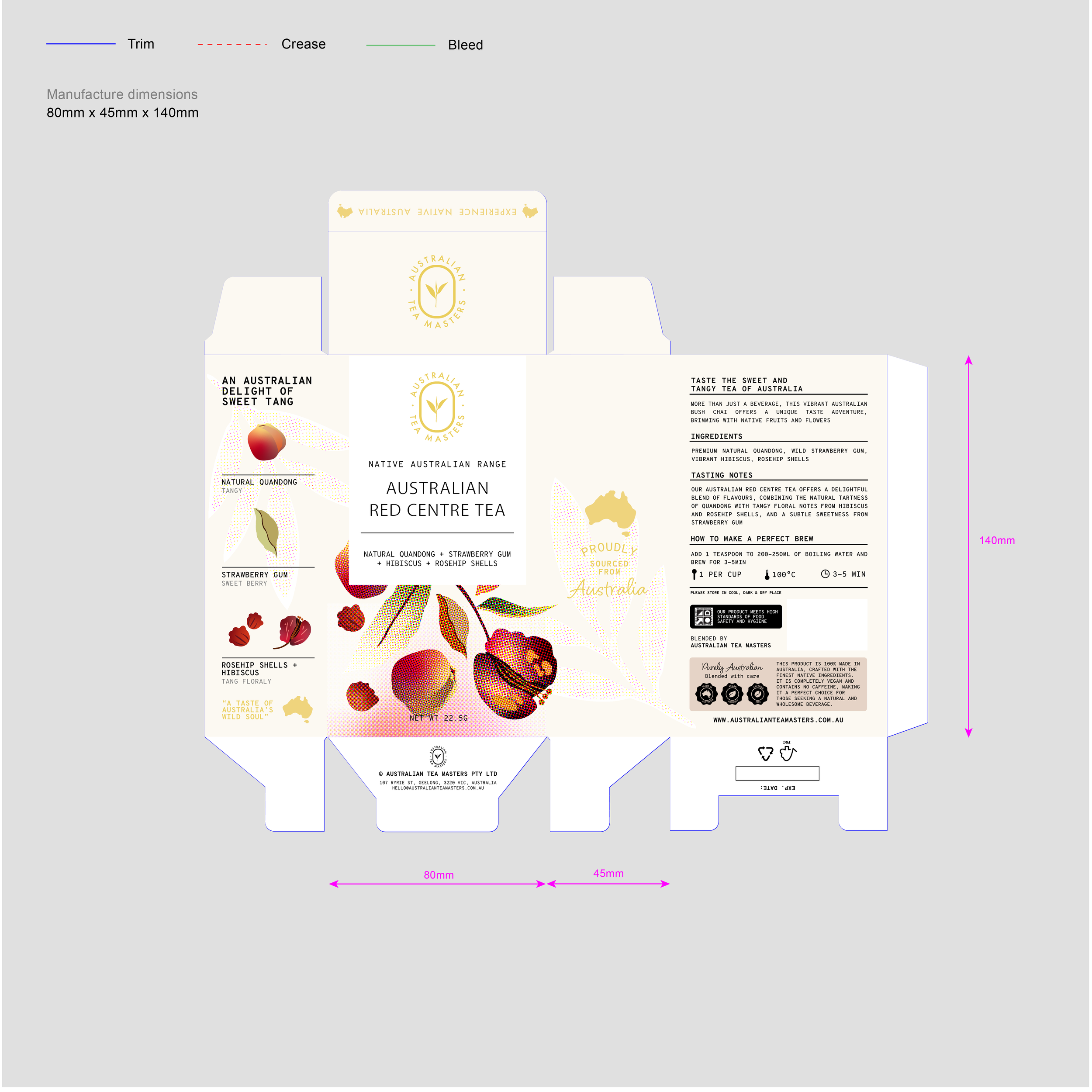
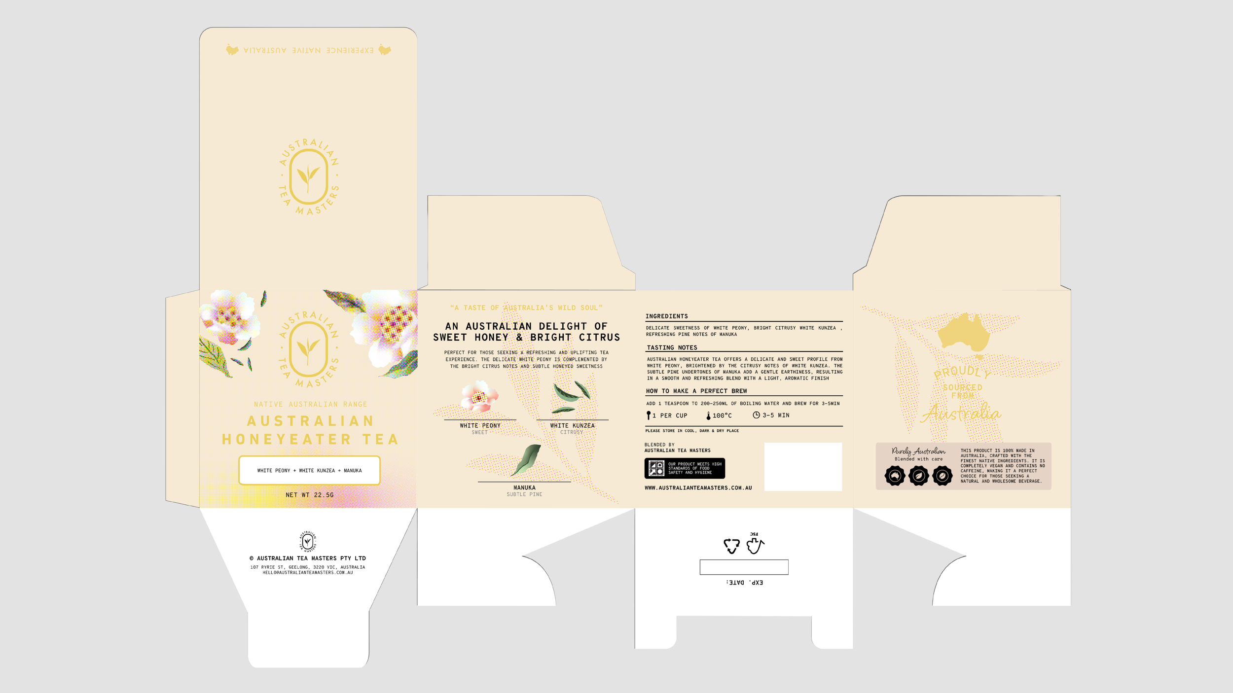
PACKAGING — AUSTRALIAN NATIVE TEA BOX
-
Australian Native Range started with simple pouches. Functional? Sure. Exciting? Not even close.
The mission was clear: take this tea, made with the most expensive native ingredients, and give it the glow-up it deserved.
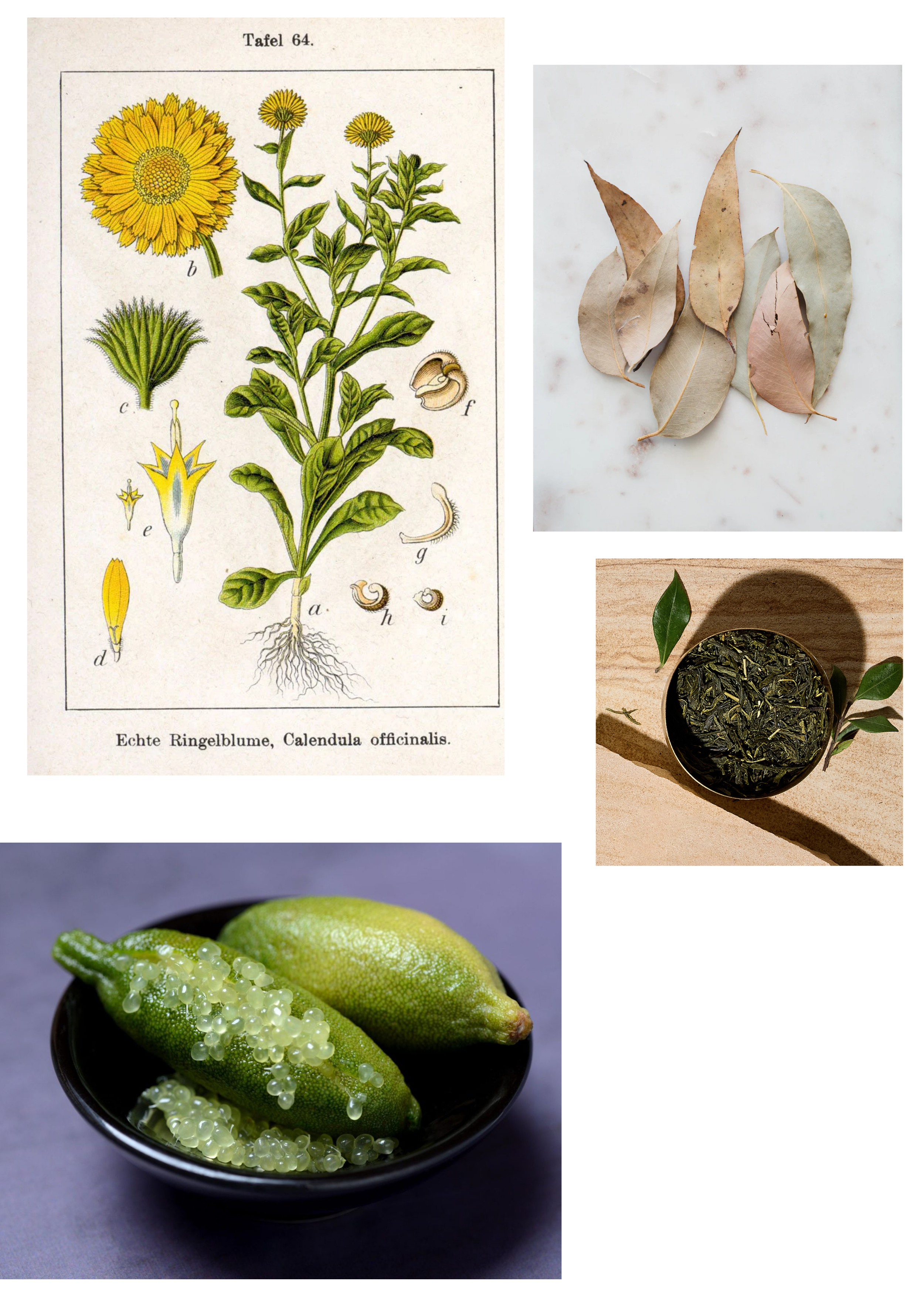
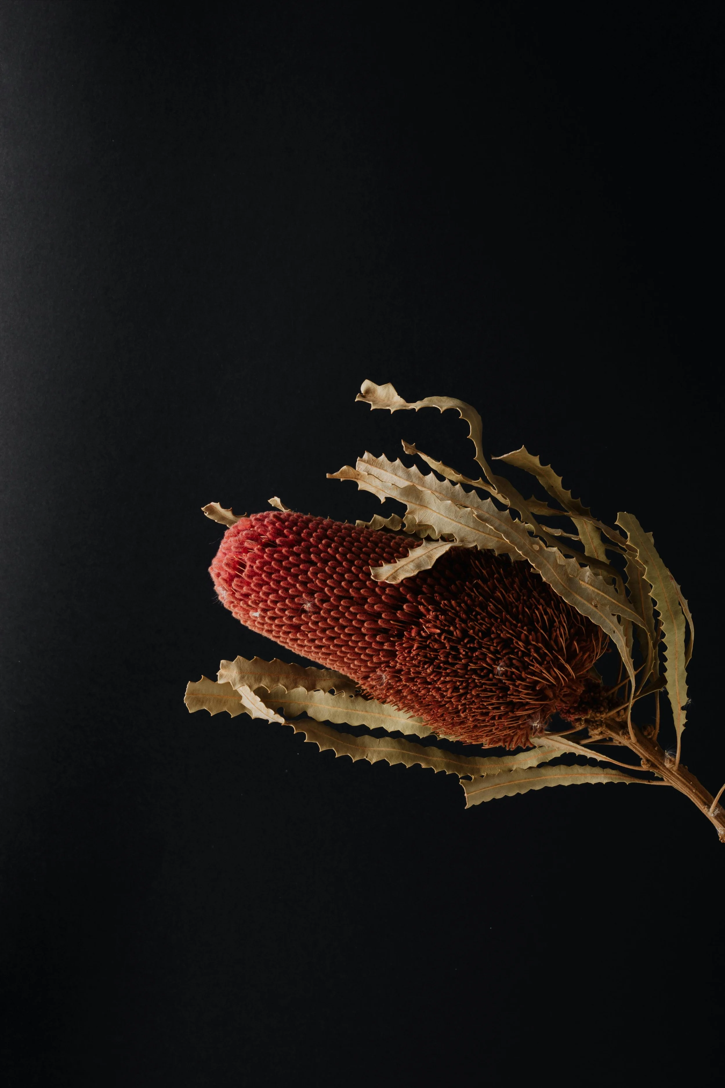
Enter premium boxes, six glorious sides to tell a story that blended sophistication, artistry, and education. Inspired by Australia’s rugged beauty, I paired earthy cream tones with hand-drawn native ingredients, polished them into sharp vector art, and combined them with clean layouts that screamed luxury.
With the team’s input, every detail was dialed in to perfection, turning the packaging into a bold showcase that made this tea impossible to ignore.
Premium tea, premium packaging, done right.
AUSTRALIAN RED CENTRE

AUSTRALIAN SUNSET

AUSTRALIAN SUNRISE
AUSTRALIAN BREAKFAST

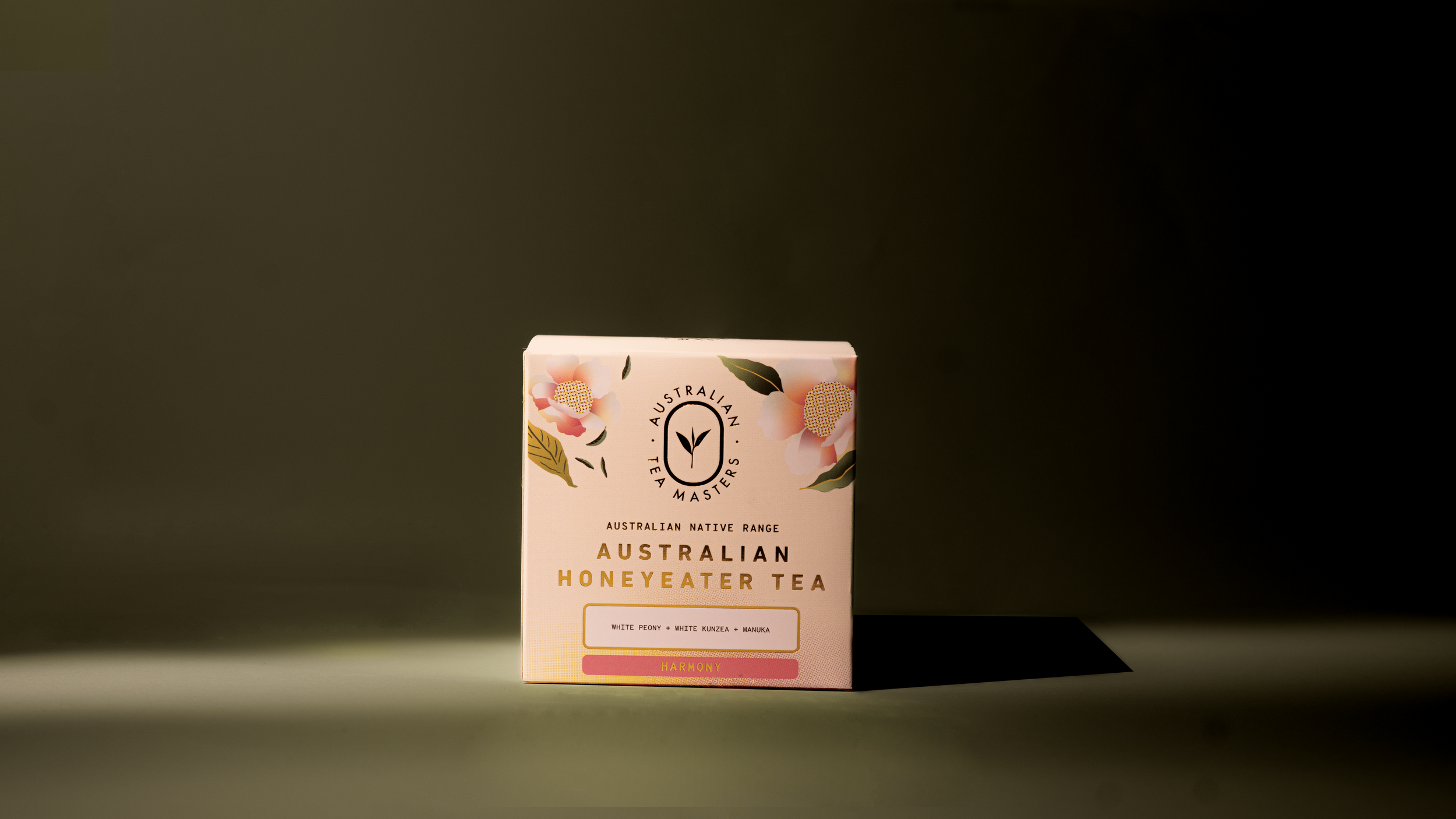
AUSTRALIAN HONEYEATER
The Beginning
from pouches to Premium Boxes
It started with simple plastic pouches featuring two-sided printed labels. The design used raw hand-drawn illustrations, but it lacked the premium feel the product deserved.

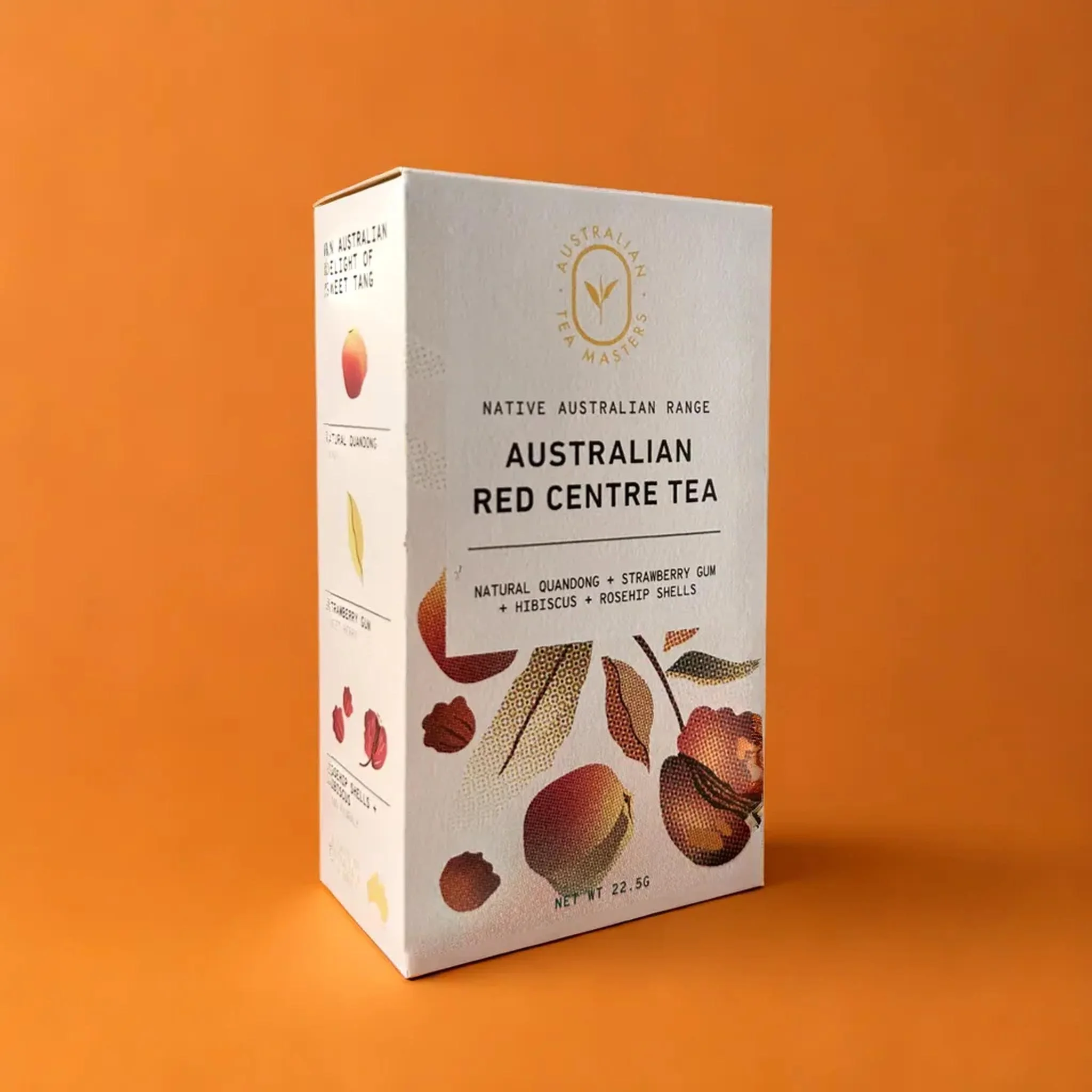
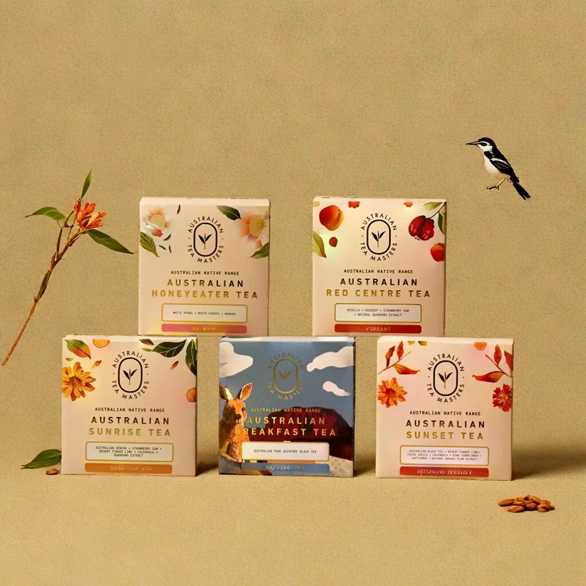
Illustration Process
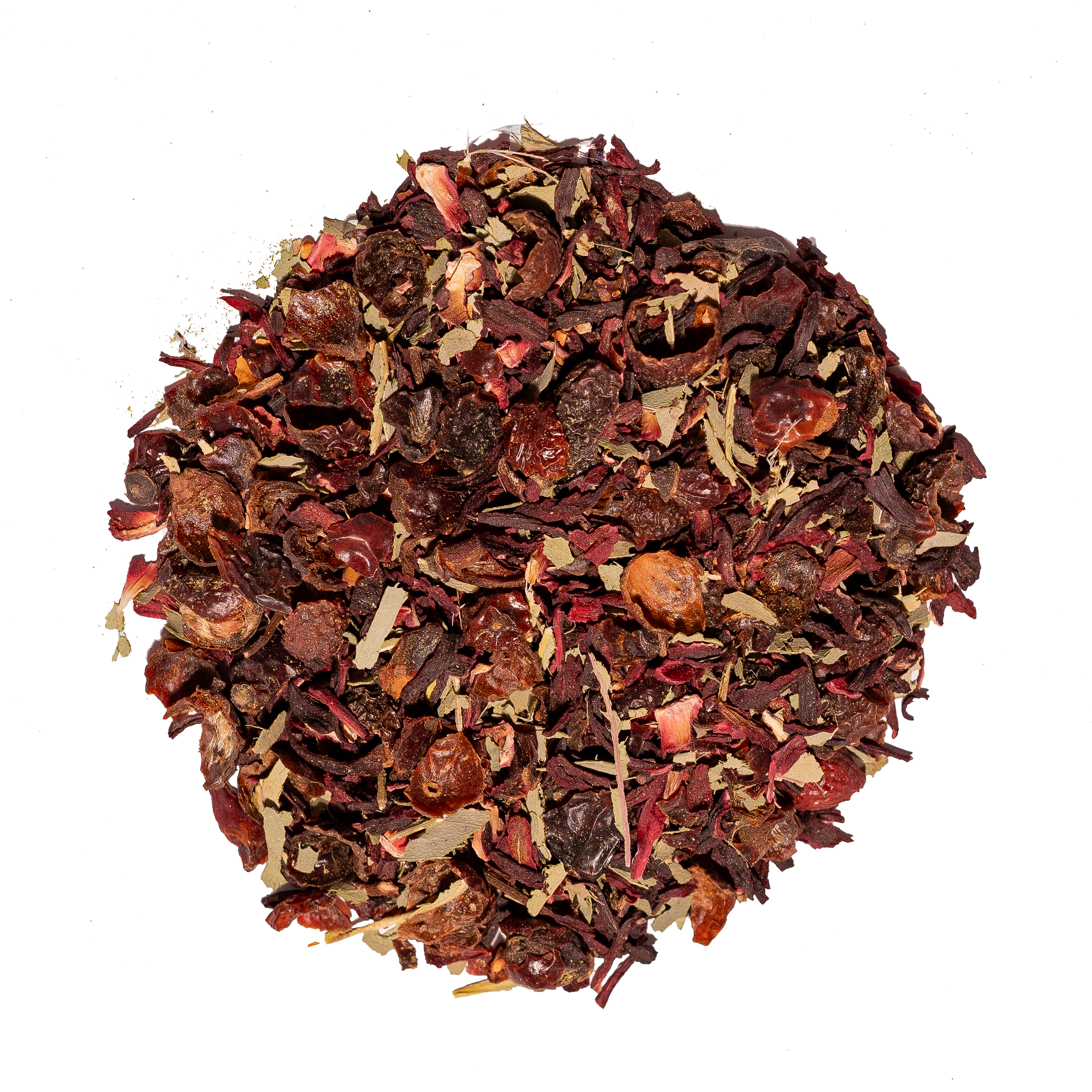
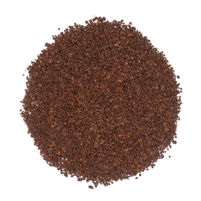
Bringing Ingredients to Life
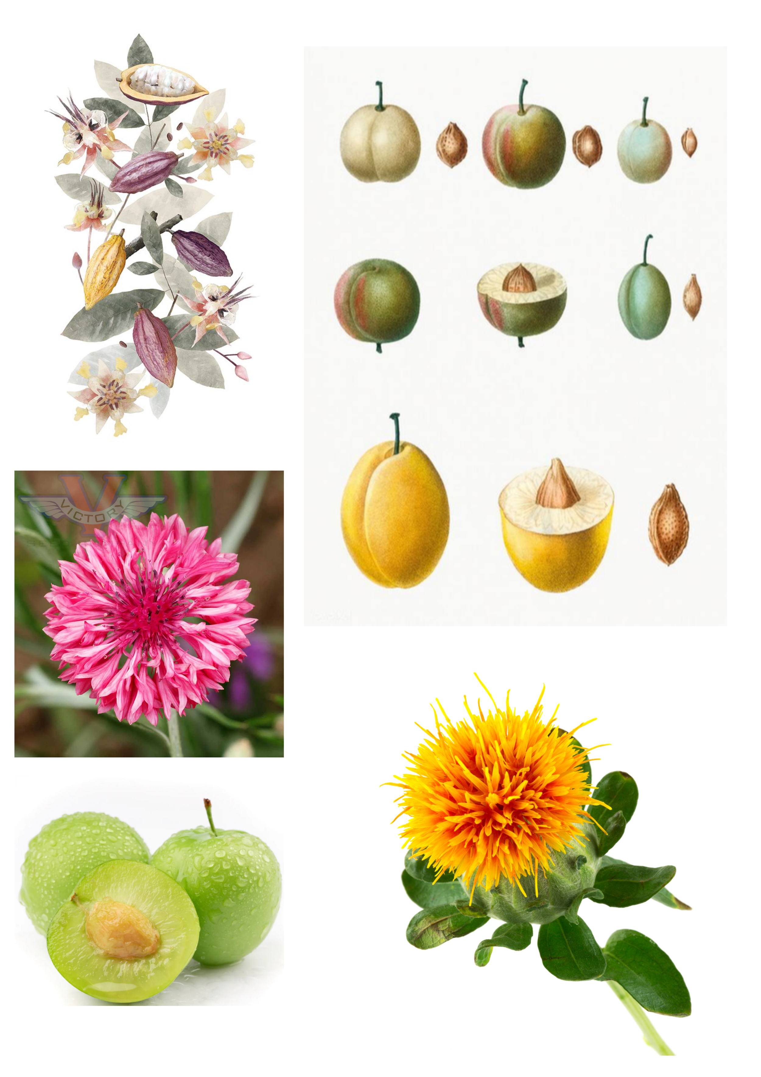
Each native ingredients was digitally hand-drawn to illustrate the Australian Native ingredients. These drawing were then polished into sharp vector art and paired with a tall, elegant box design. It looked stunning — until we hit a snag. The tall box? A shelf-space nightmare. It couldn’t stack. So, we went back to the drawing board.


Redesigning The box
Back to the drawing board
The CEO suggested rethinking the dimensions, and we landed on a square box that nailed both functionality and premium vibes. I reworked the illustrations and design to fit the new layout, making the packaging not just beautiful but retail-ready. Problem solved.
BEFORE
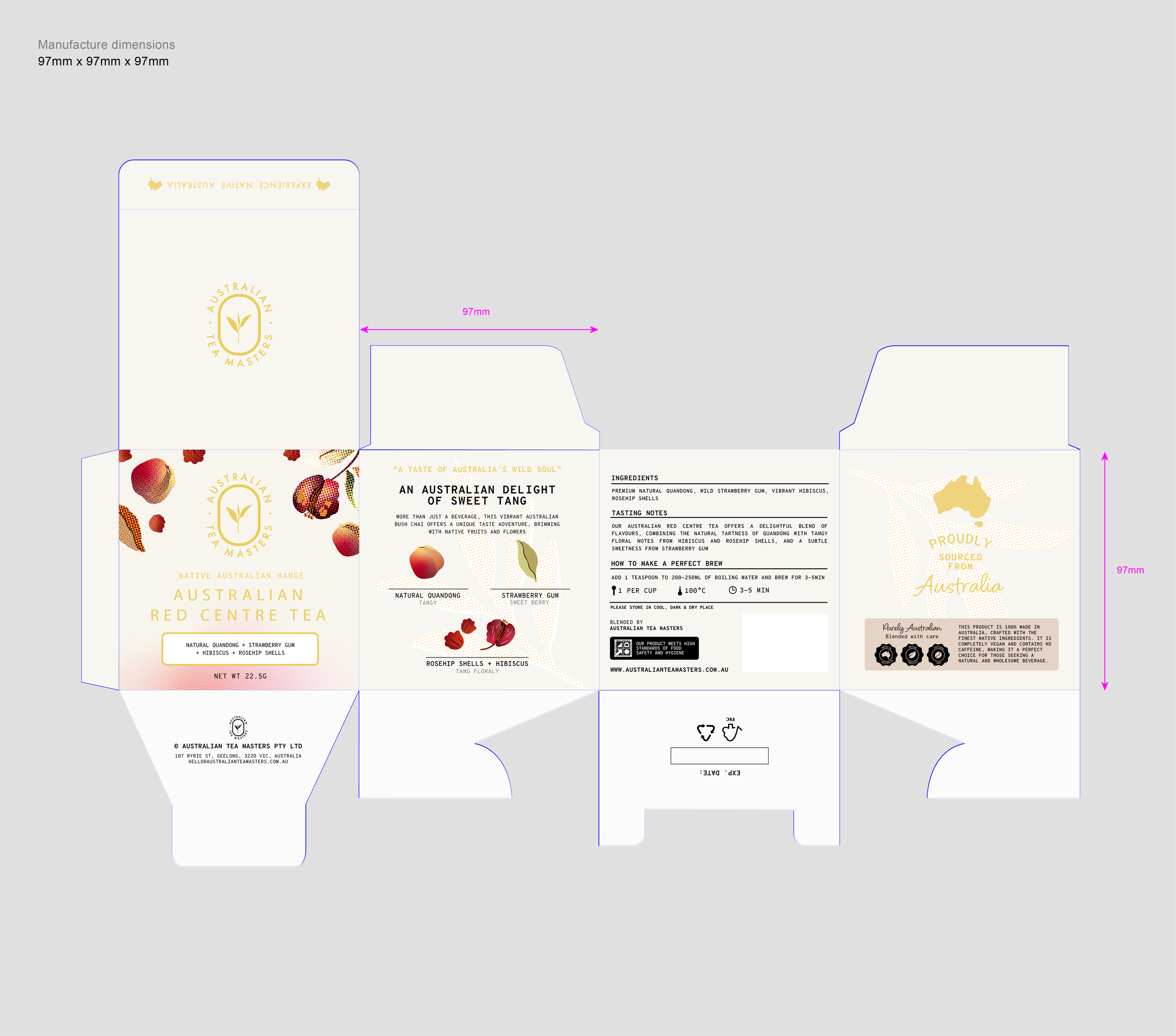
AFTER


colour palette & typography
the look & feel
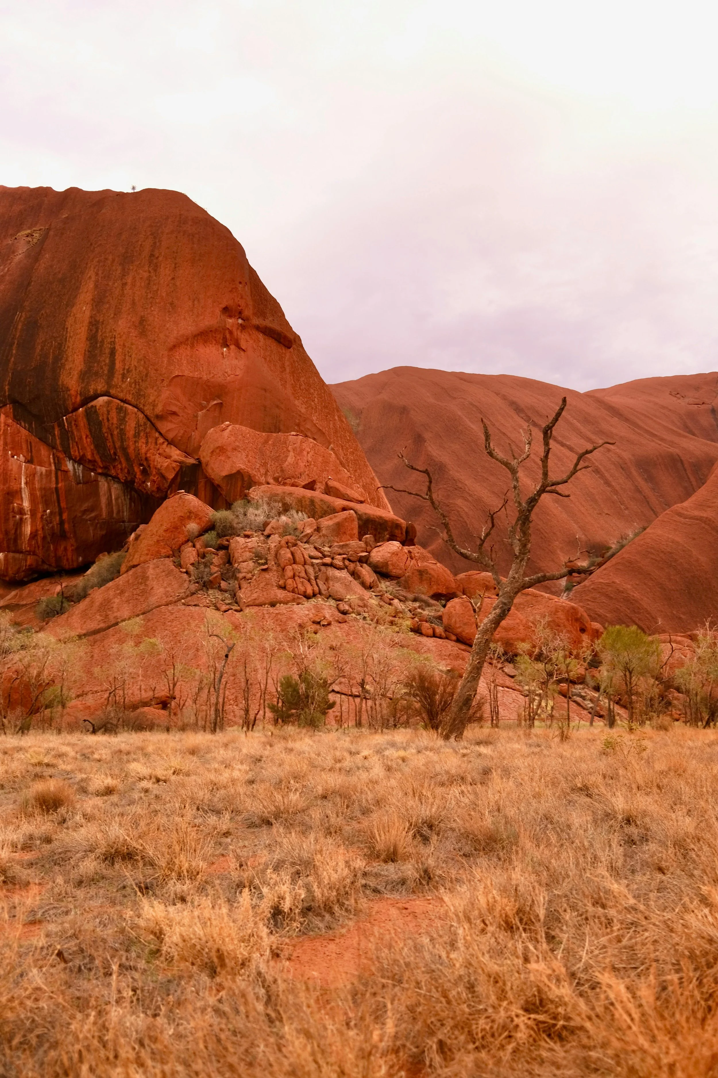
Straight from the heart of Australia. Think the soft creams of patchy stone, the warmth of weathered bricks, and the earthy tones of the outback — a palette that feels raw, grounded, and unmistakably premium. These hues set the stage for a design that’s as sophisticated as it is connected to nature. Add in clean, modern typography for that perfect mix of elegance and edge, and you’ve got a look that screams luxury with a story.


Collaboration In action
feedback that shaped the final design
From marketing to accounts with the director and CEO, every piece of feedback refined the design, ensuring it resonated with both the brand and its audience.
the final product
the premium box, perfected
The new design elevated the Native Australian Tea Range, positioning it as a luxury tea range, telling its unique story and connecting deeply with customers.