AUSTRALIAN TEA MASTERS
Australian Tea Masters launches a new blend of collagen, featuring Matcha and Vanilla Collagen, and it needs packaging that matches its vibe: clean, natural, and premium. It’s a blend designed to boost wellbeing and beauty, and the stick sachet design mush reflect that balance.
The goal is to design a look that speaks directly to health-conscious, lifestyle-driven individuals while staying true to the Australian Tea Masters’ reputation for sophistication in the wellness space.
PACKAGING — WELLNESS IN EVERY SACHET
-
The Aesthetic
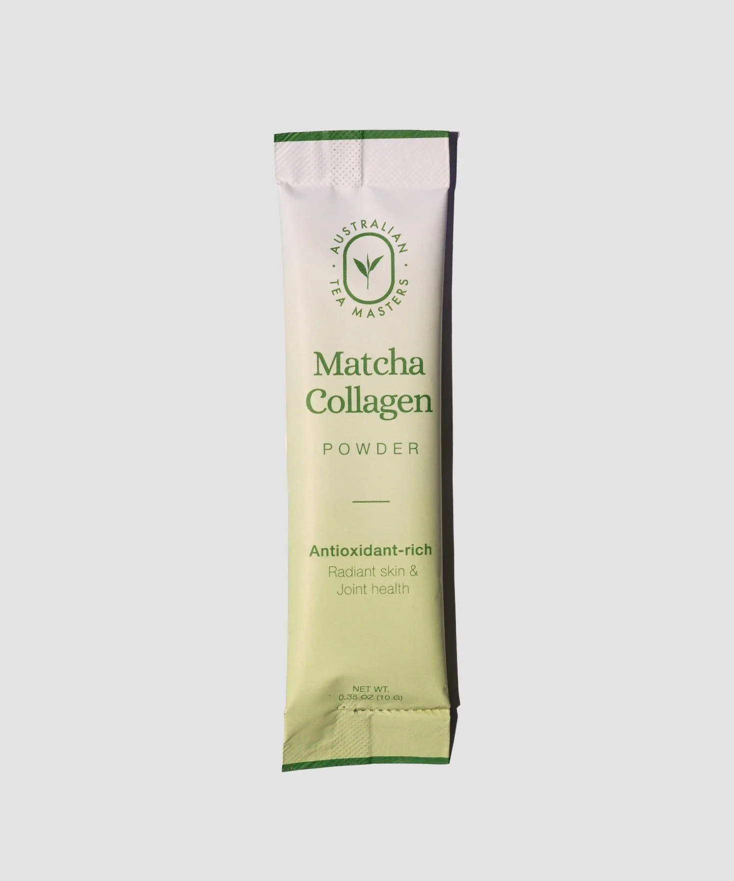
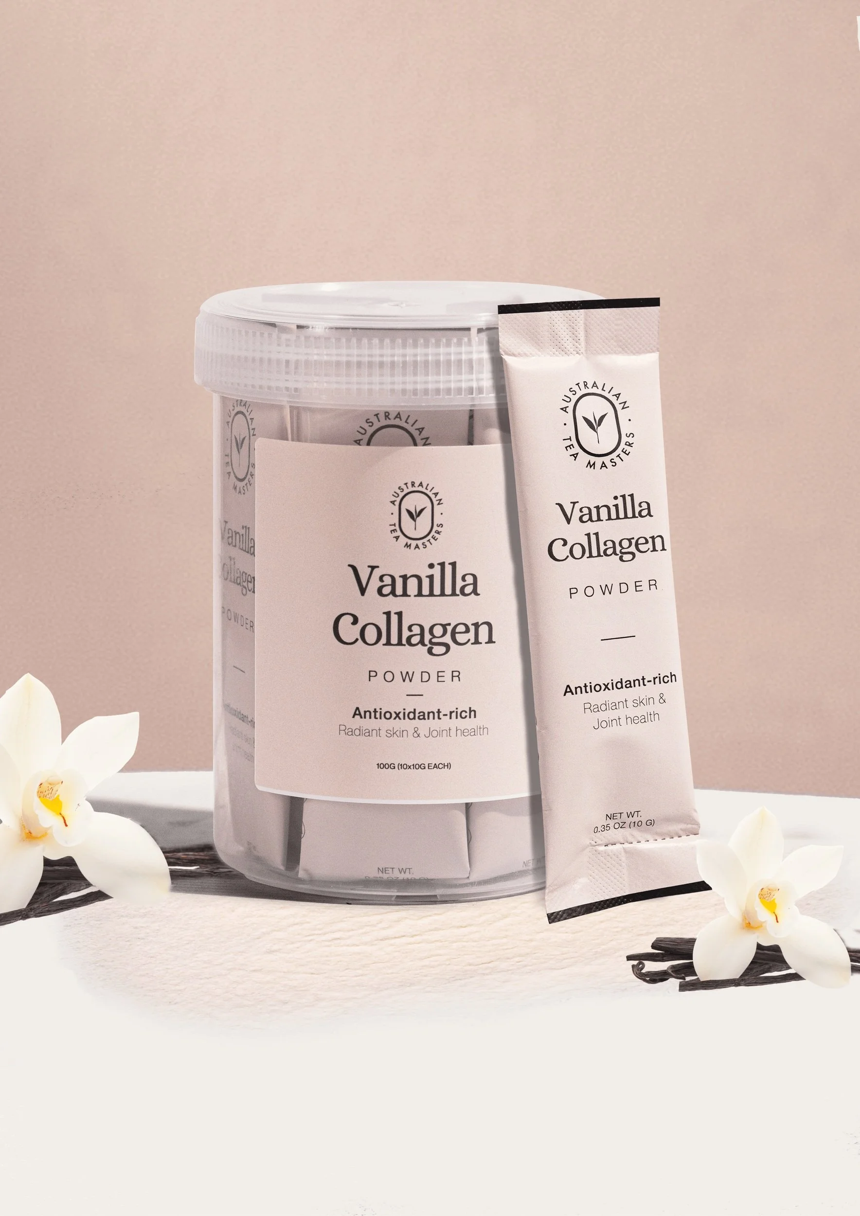
The health, beauty, and wellness sector thrives on modern and minimalistic design because it conveys purity, transparency, and professionalism — values consumers prioritise when choosing wellness products. Drawing from these principles. the design embraces a soft, natural palette inspired by the ingredients: vibrant matcha greens and creamy vanilla tones. Minimalist typography and generous negative space ensure the packaging is approachable and clean.
The purpose
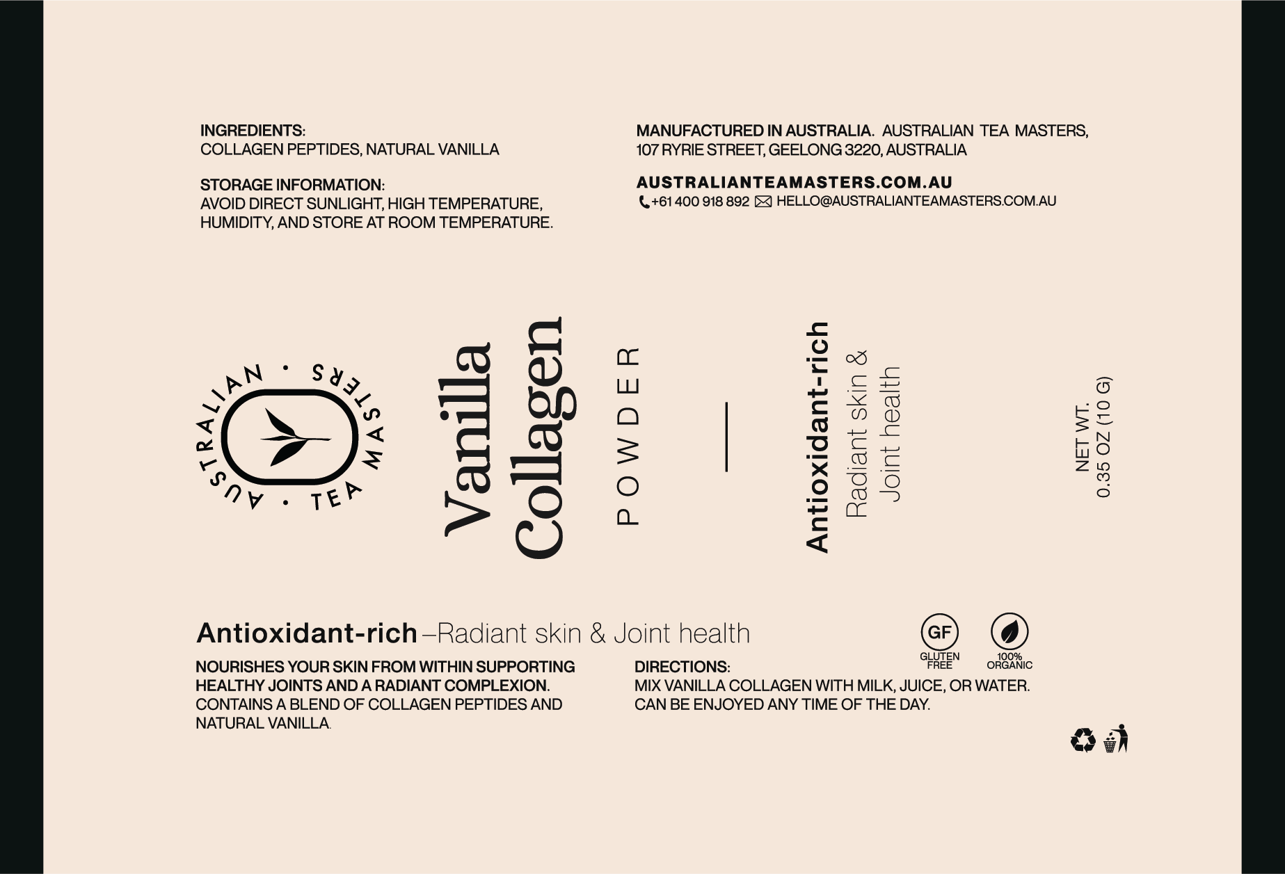
The packaging is more than a design — it’s a bridge between the product and the customer. Clear, organised layouts will highlight essential product details such as being organic and gluten-free, using intuitive icons to guide customers easily. This approach ensures transparency without overstating claims while reinforcing trust and functionality. This design is intentional and grounded in research, utilising the minimalistic style that dominates the health and beauty sector to create a product that feels modern and elevated.
laying the Groundwork
Research for Design Foundation
The process began with in-depth research on stick sachet packaging. I explored various types of sachets in the market, analyzing sealing methods, size variations, and material options to find the perfect combination of functionality and visual appeal. From compact sachets to larger ones, and materials ranging from eco-friendly finishes to glossy labels, the goal was to ensure practicality while maintaining the premium feel of the product. Ultimately, the medium-sized sachet was selected as it perfectly holds 10g of powder — the standard for a single serving of matcha.

TUBE PACKAGING

POUCH PACKAGING

SQUARE SACHET PACKAGING

STICK SACHET PACKAGING
Defining the Design direction
Premium quality & accessibility
Researching design trends in the health and wellness sector for collagen products provided valuable insights. Many brands opted for clean, informative designs with distinct colour palettes to distinguish flavours or product types. Some high-end options used metallic labels and premium tube packaging, creating a luxurious feel. While these approaches inspired elements of sophistication, the final design choices were carefully curated to balance premium quality with accessibility. This ensured alignment with our target audience in Geelong and the broader scope of online sales.
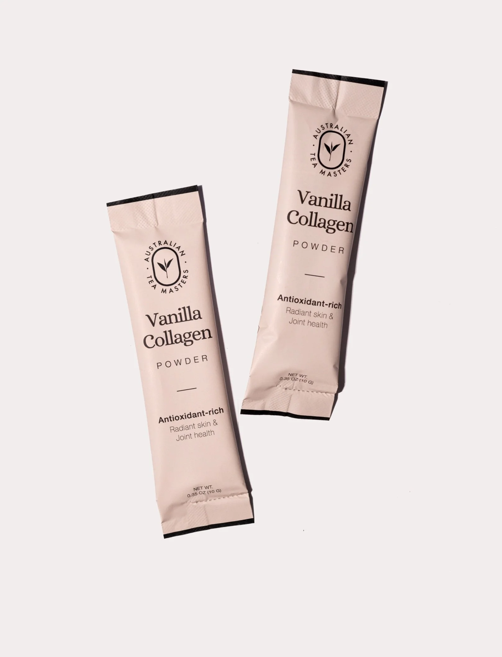
Hence, we decided on stick sachet packaging. This choice aligns with the product’s target market, offering a sleek and practical design that feels modern and elevated while remaining approachable for health-conscious consumers. The stick sachet format also enhances portability and ease of use, making it a thoughtful option for the wellness segment.
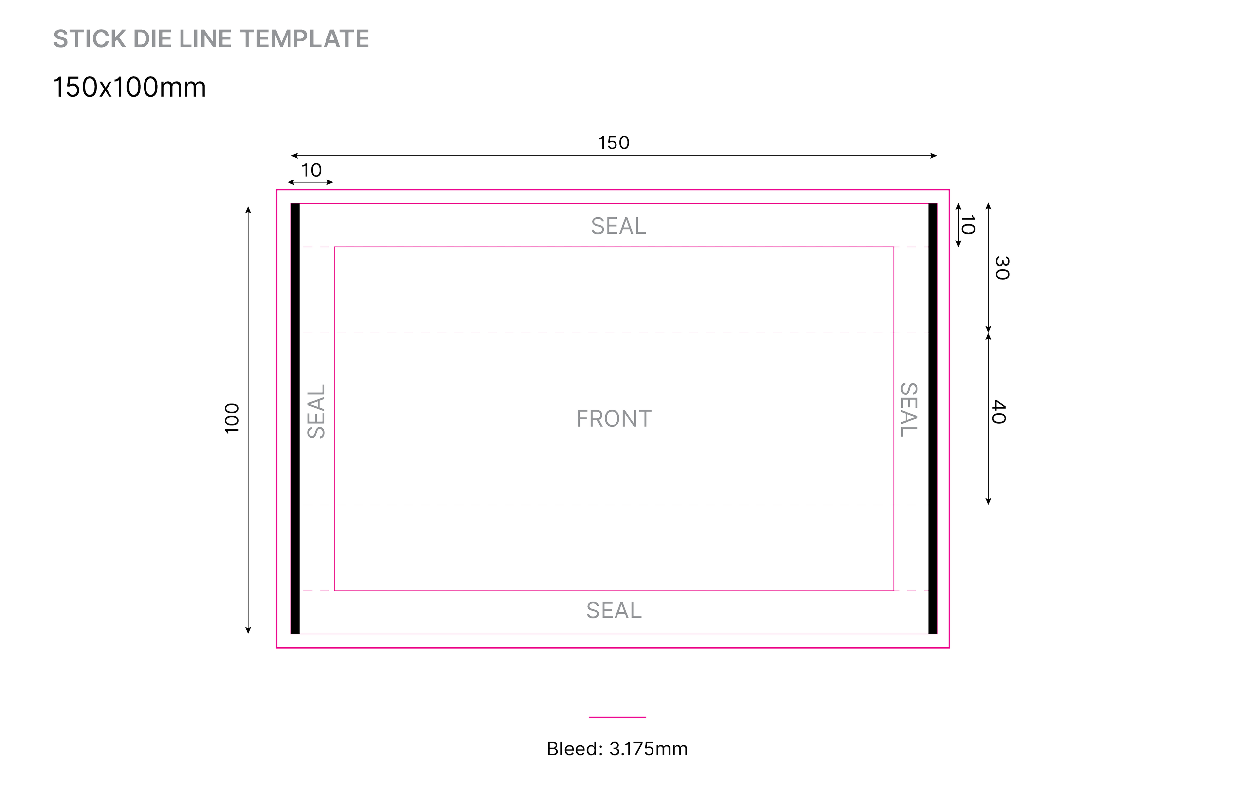
The layout is everything
Modern - Clean - Minimalistic
When designing with a modern, clean, and minimalistic style, the success of the design often comes down to the layout. For stick sachets, the narrow space presents unique challenges, and the choice between a landscape or portrait layout became critical. We chose the portrait orientation for several reasons:
Ergonomics
A portrait layout matches how users typically hold and interact with sachets, making the information more intuitive to read
Visual Hierarchy
The vertical flow of portrait layout helps guide the eye naturally, ensuring key details stand out.
Shelf Presence
Portrait sachets stand taller on shelves, making them more visually prominent in retail environments compared to horizontal counterparts.
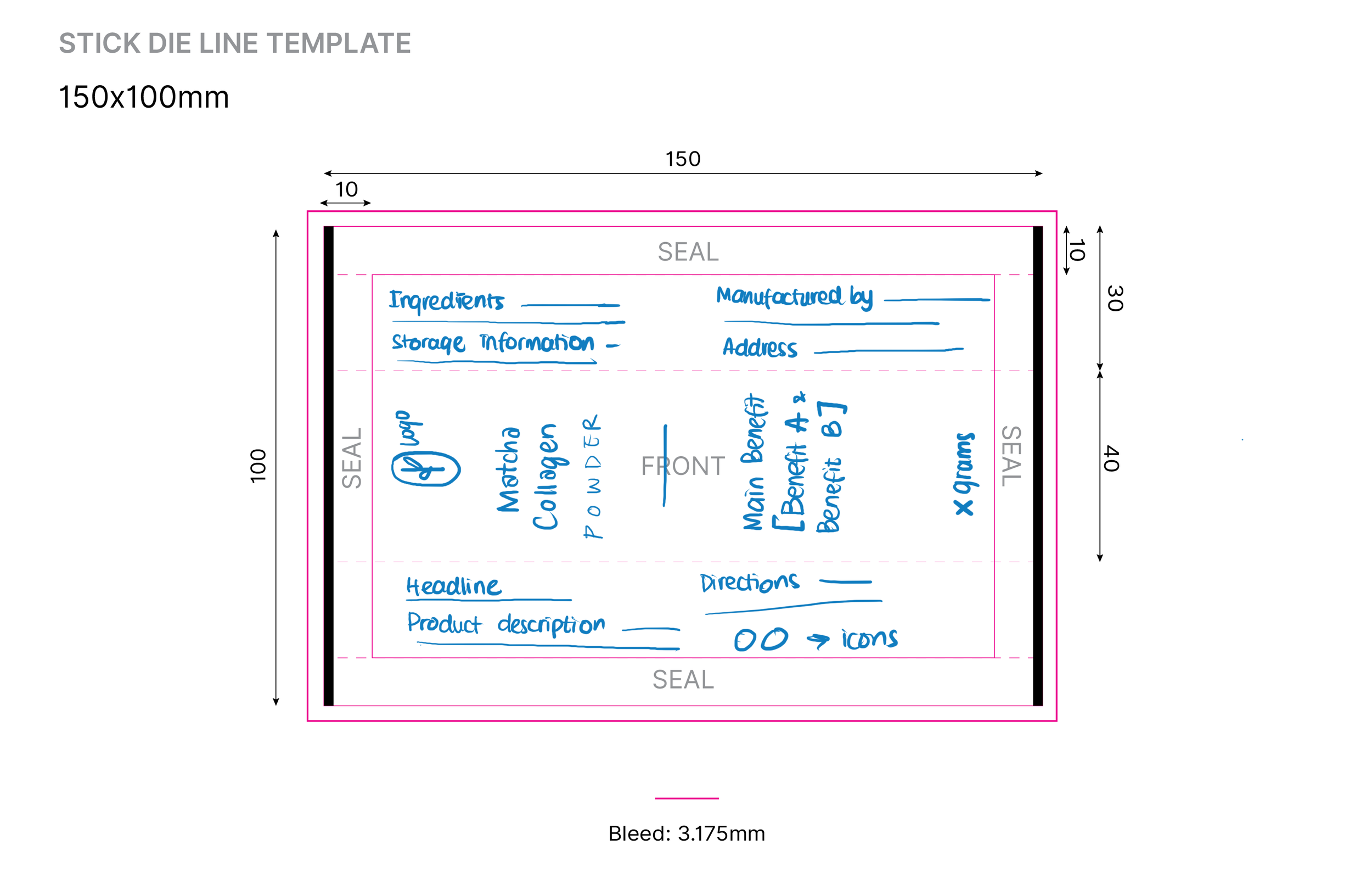
To further enhance readibility and balance, all text was aligned to the center. This approach promoted visual cleanliness, reduced clutter, and aligned with the minimalistic design principles. Negative space and simple typography worked together to create a calm and elegant feel, reflecting the product’s focus on health and beauty.
The Result
A blend of functionality and Sophistication
The final design is a thoughtful blend of functionality and sophistication. It celebrates simplicity, ensured ease of use, and positions Australian Tea Masters’ Matcha and Vanilla Collagen sachets as a standout product in the wellness market.

