AUSTRALIAN TEA MASTERS
Australian Tea Masters set out to create a premium and cohesive visual identity for their ceremonial matcha and cacao products. The goal was to craft packaging that exudes luxury, trust, and timeless elegance while setting the foundation for a unified brand aesthetic across their entire product line.
BRANDING — tIMELESS DESIGN, ELEVATED
-
The Strategy
The design focused on minimalism and functionality, aligning with the principles of modern premium branding. The label design emphasized clean layouts, balanced typography, and a sharp, professional aesthetic to communicate quality and sophistication. Amber glass jars were chosen to enhance the product’s premium positioning while offering practical benefits like preserving freshness and protecting against light exposure.
The Outcome
The final design delivers a sleek, timeless look that elevates the ceremonial matcha and cacao products. It sets the tone for a cohesive brand identity, positioning Australian Tea Masters as a leader in the tea market with elegance and purpose.
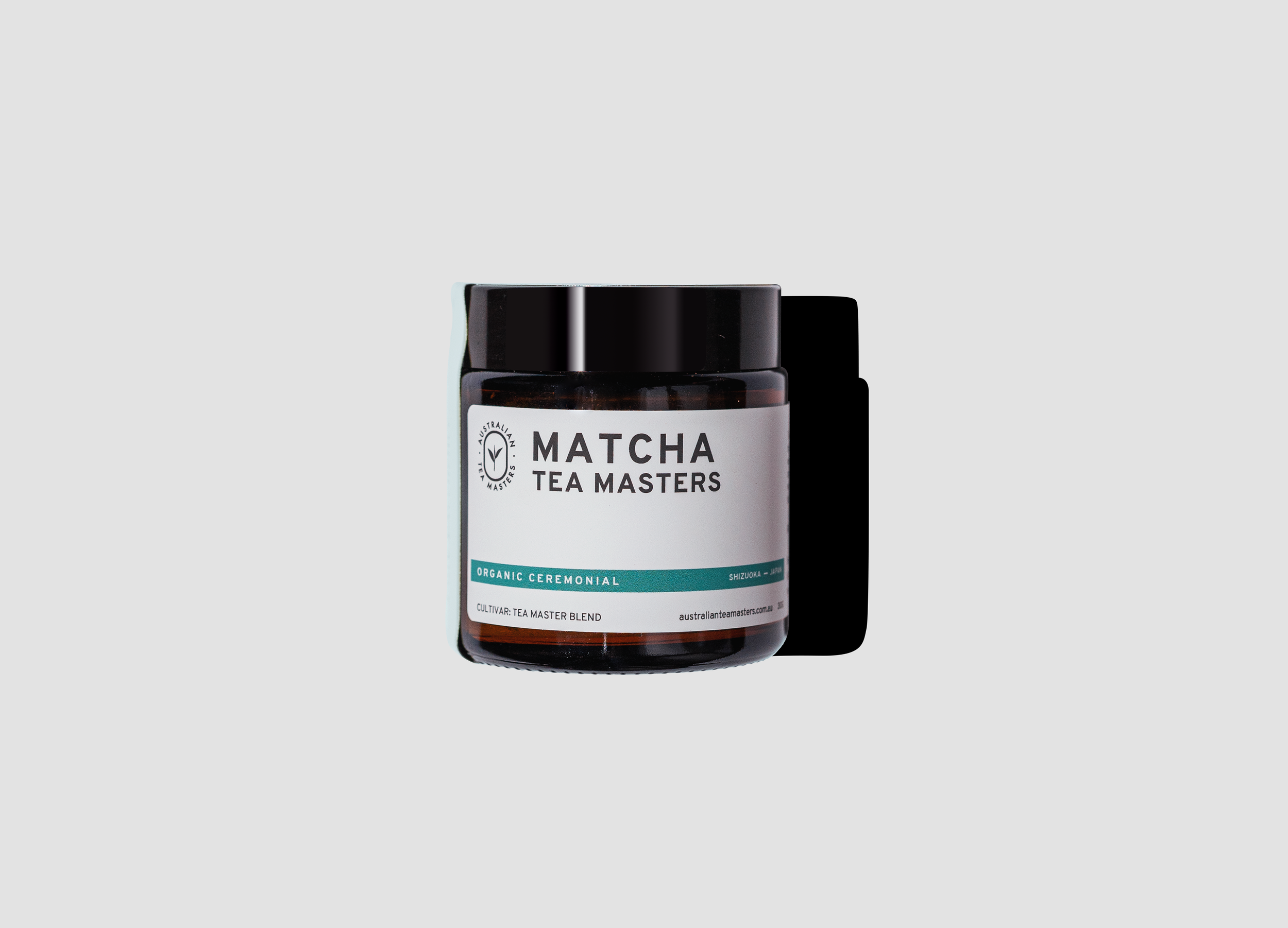
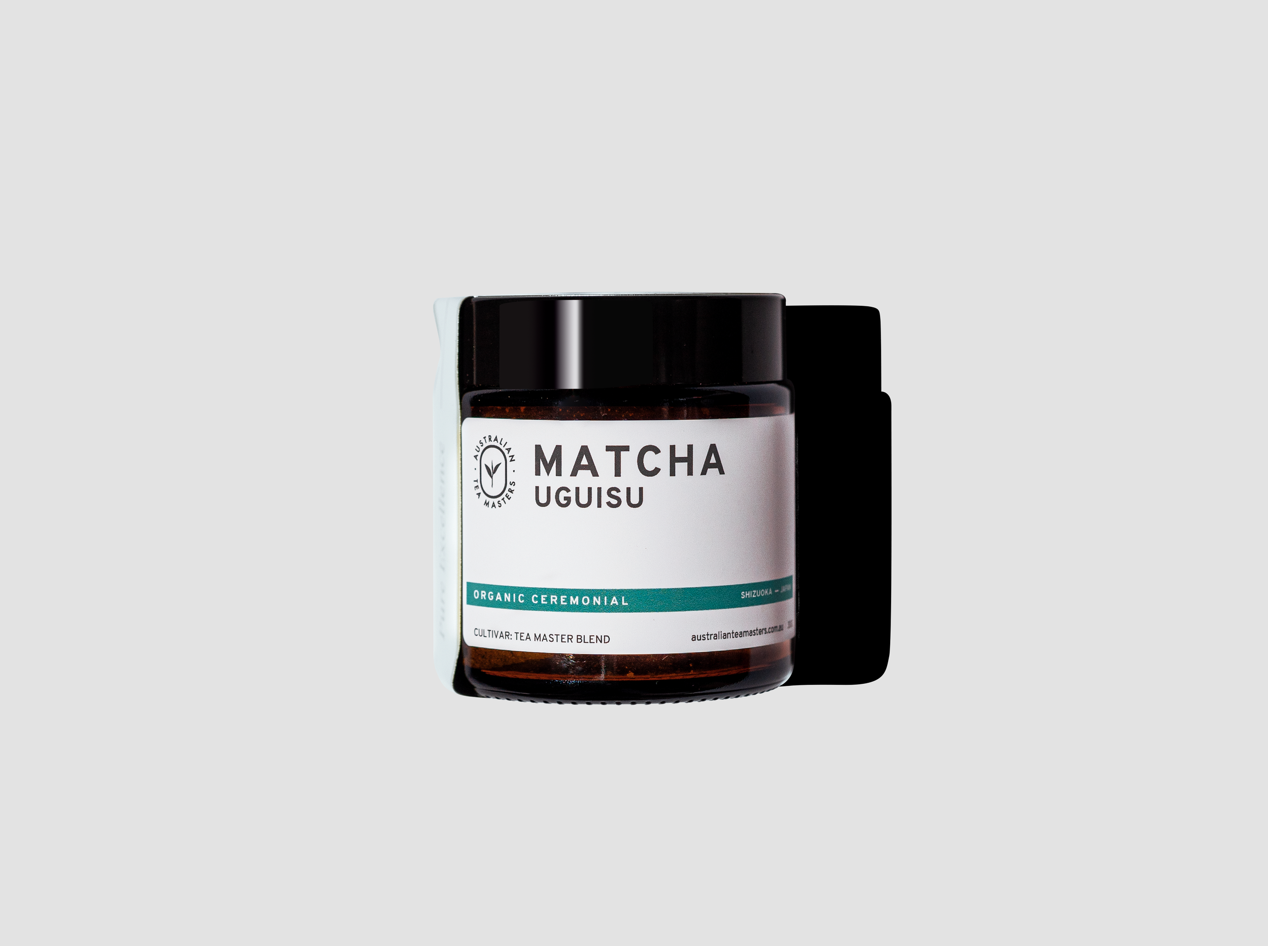
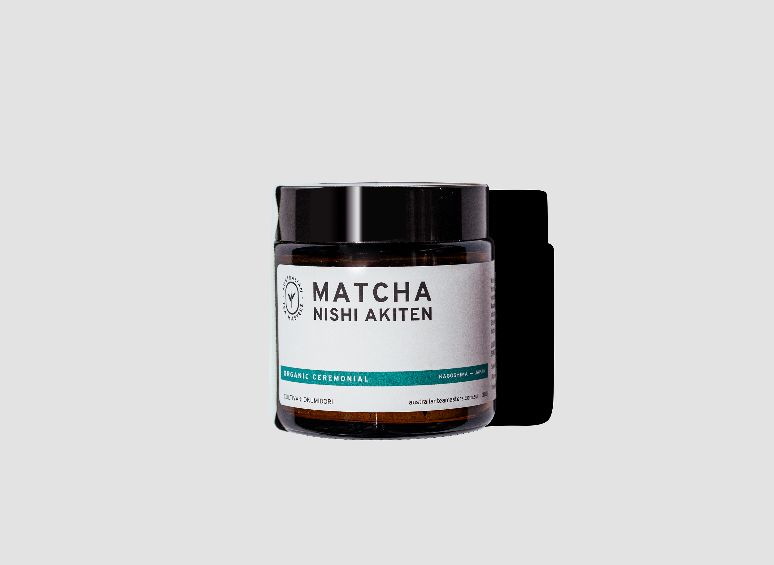
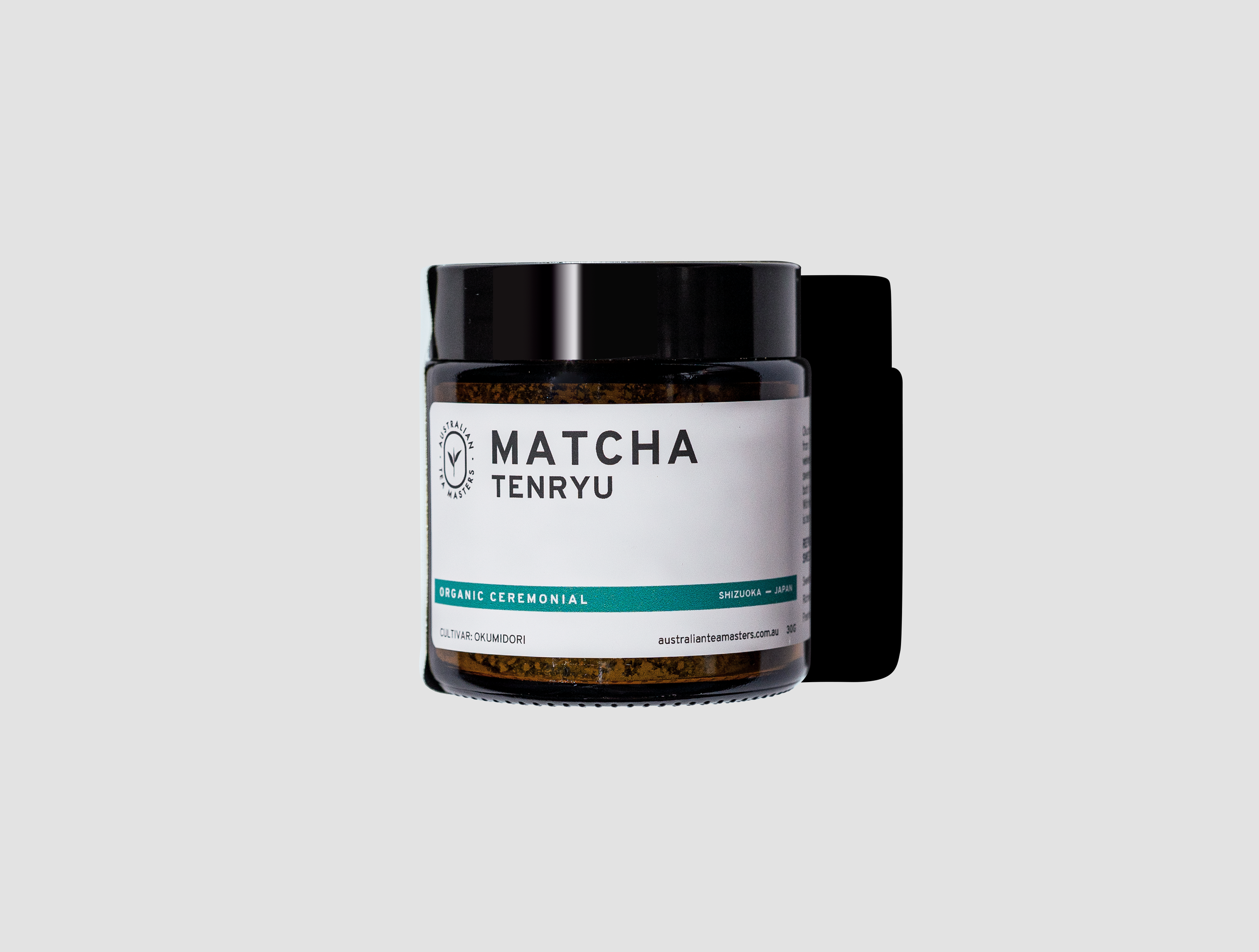
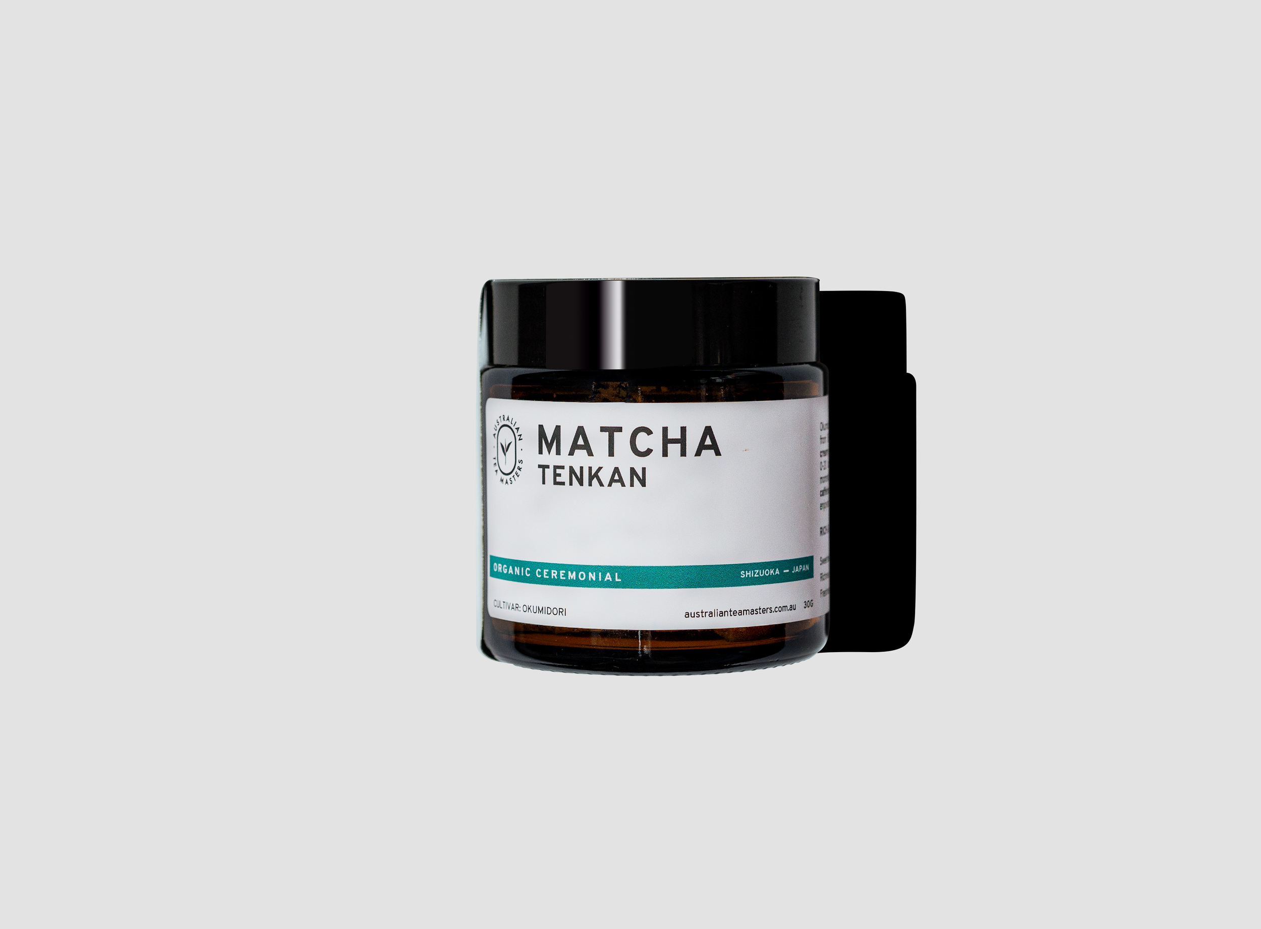
ceremonial Matcha Label
It is minimalistic and trustworthy label that sets the tone for premium matcha. The layout is meticulously designed to prioritise key information: the matcha name, cultivar, origin, and the unique story behind it. Essential details like tasting notes, health benefits, and brewing instructions are presented through clean layouts, ensuring clarity without clutter.
Every element on this label is intentional. combining functionality and elegance to elevate the product’s identity. All the essential information is neatly packed and ready to be placed on the amber jars, making this ceremonial matcha a perfect blend of design and purpose.


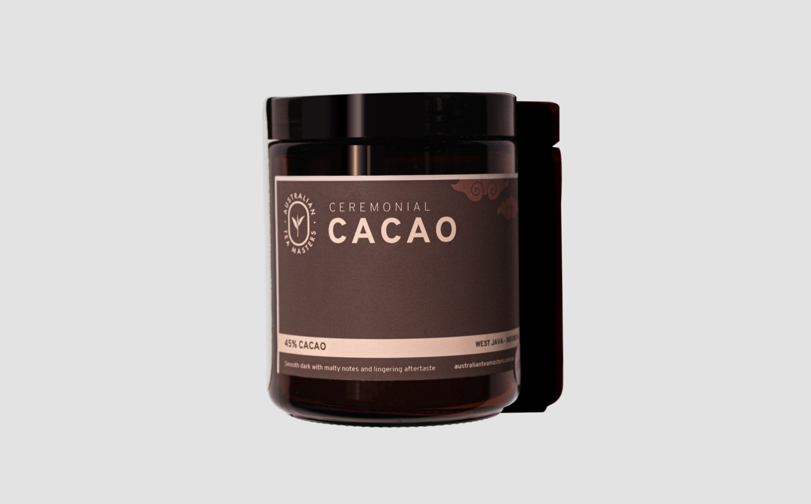
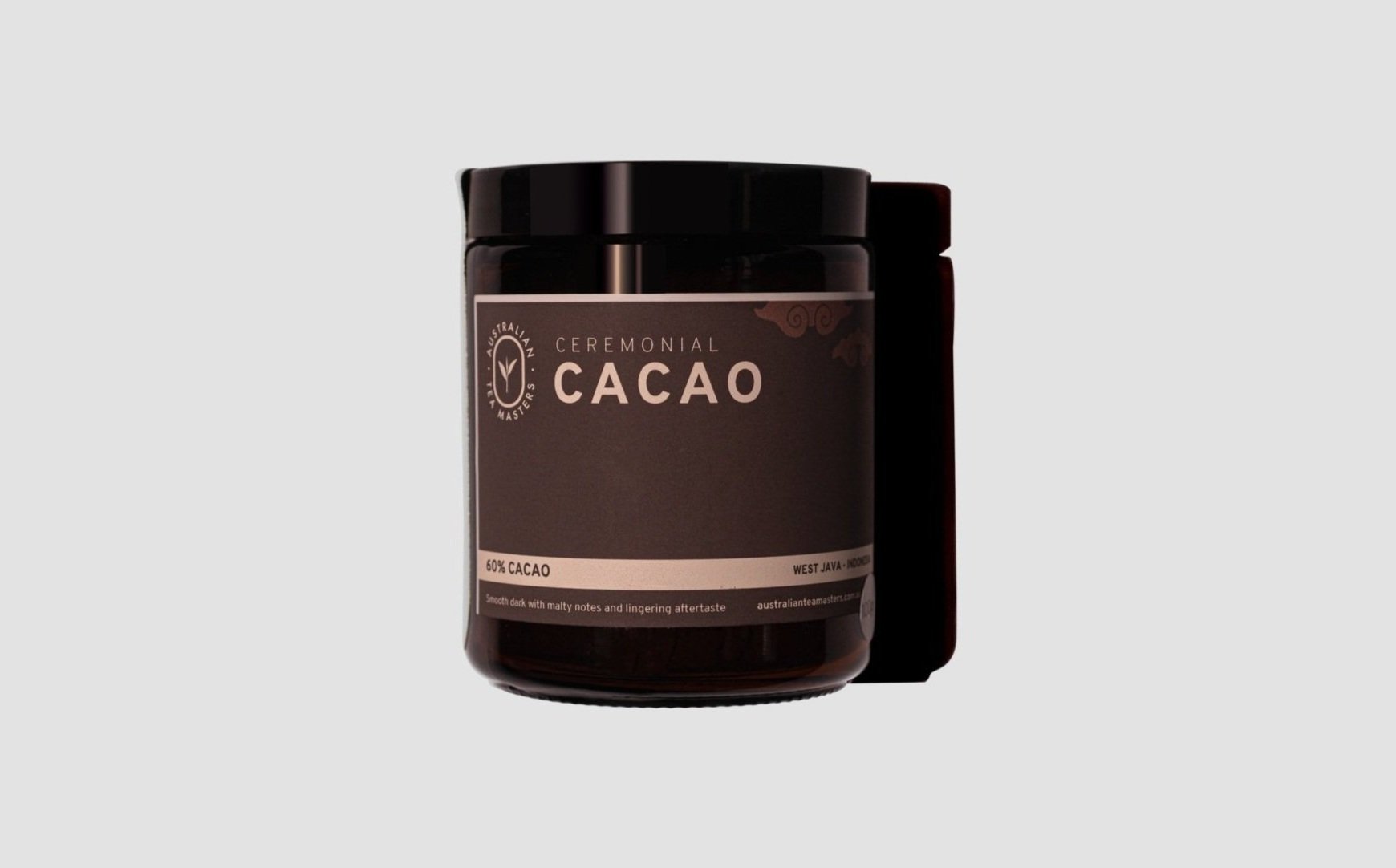
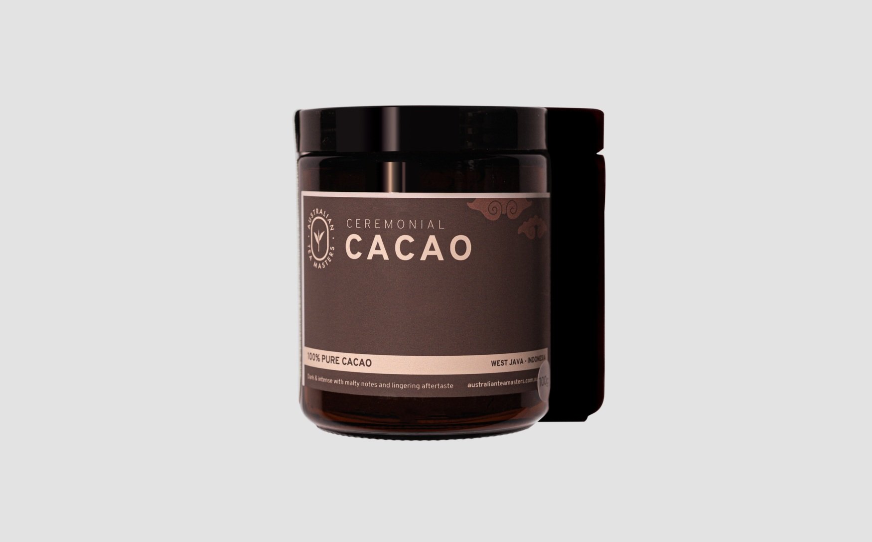
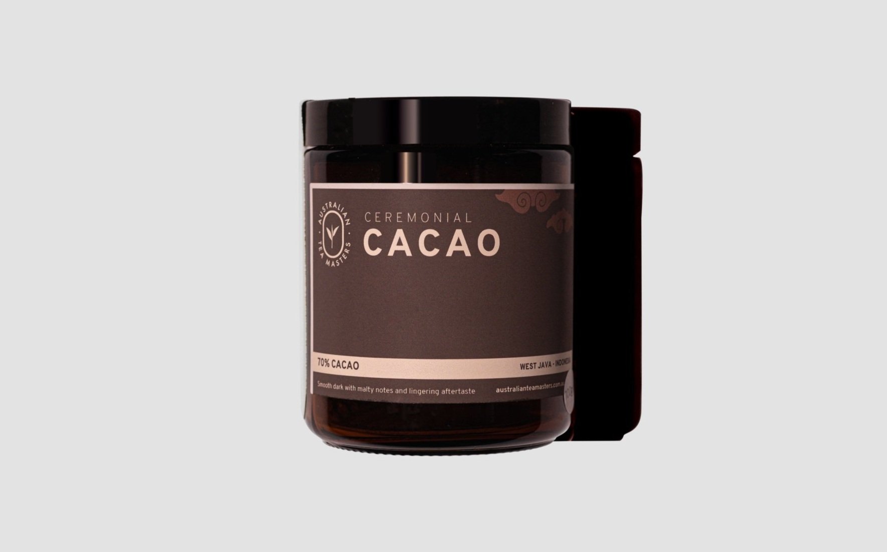
ceremonial Cacao Label
The ceremonial cacao label follows the same premium, minimalistic approach as the matcha, but with its own unique identity. The design integrates colours that reflect the varying shade of cacao — ranging from 100% to 45% — with the subtle gradations that mirror the richness and depth of the product. To highlight the origins, the West Java and Bali icons are incorporated, each representing the distinct profiles of cacao from these regions.
The label tells the story of the cacao’s origin, emphasizing the differences between the cacao grown in West Java’s higher grounds, which offers a rich, chocolatey aroma and taste, and the cacao from Bali’s hot, lush terrain, known for its fruity and complex chocolate flavour. Alongside the story, the label also includes essential tasting notes and simple instructions for brewing the perfect cup of ceremonial cacao
Every element is carefully designed to showcase the uniqueness of the cacao while maintaining the clean, elegant design. Ready to be applied to the packaging, this label encapsulates both the heritage and the premium quality of the cacao inside.